Monday, October 8, 2018

Continuity Task 2

1.I filmed Most of the shots.

2. When planning the scene, we had to make sure the story made sense to the audience and was easy to follow, so we planned out what the actors were going to say in the conversation, and we planned out how the shots would transition between one another to keep narrative flow. We also planned out where we were going to film the scene and what order the shots were to come in in the final product in order to make sure there were no continuity errors.

When shooting the scene we had to make sure there were no continuity errors by making sure all of the characters were in the correct place whenever a new shot was started. We also tried our best to make sure that the dialogue spoken was the same between the shots to make sure of this as well. We had to abide by the 180 degree rule as well while shooting, as this was done by shooting the conversation twice, at the 2 correct camera angles, and then cutting between them in post. We also payed special attention to the framing of the shots in order to make the scene easy for the audience to understand, and to retain narrative flow.

When editing, yet again we needed to make sure there were no continuity errors, and this was done by making sure no clips were cut in where the lines of dialogue were different from the shot before it, and also by cutting clips with actors in the same position as they were before. We also made sure to edit the clips together in a way to keep narrative flow, and this was done by making sure all the clips were all in the right order, and that they were all edited with clean cuts between them.

3. I think our sequence was quite successful. We did manage to demonstrate match on match action in most of our shots, however some of out shots showed continuity errors. When Virginia is holding the detention slip, it changes hand between both of the shots it is in. However, we did manage to abide well by the 180 degree rule. I think we did stick to the brief in this task.

4. After completing this task, I have learned that a mastershot should not be as zoomed out as it is in our scene, as it breaks narrative flow when it is cut to due to it being an ELS. Also, we never wrote down a script for this project, we only planned out the basic idea of what the actors were going to say. This made it a lot harder to edit in order to make sure we minimised continuity errors, so in the future I think a script would be very important.

Tuesday, October 2, 2018

Disney Trailer Analysis: The Lion King


At the start of the trailer the song in the background to the Disney ident is "The Circle of Life" which instantly displays to the audience that the Film will be a musical which then moves onto a shot of the rising shot which introduces a desert setting. The rest of the trailer uses other tracks from the film in order to present the wide range of songs that the film has. The first line of dialogue is from Mufasa saying that "we are all connected in the great circle of life" This ties in with the background music we creates the sense that he is an important character, this is emphasised by his low soft voice which will make the audience feel a sense of comfort. secondly his high position over the desert which connotes that he is in charge. As baby Simba is lifted up the voice over states that the film is called "The Lion King" This infers that Simba will also play a massive role as he is introduced with the title. This is reinforced through the the voice over saying that " he was born to rule" This will appeal to the target audience of children as the protagonist is shown to be a cub and therefore the children can relate with the him. The voice over then announces the antagonist by saying that "A shadow falls over the kingdom" followed by the antagonist Scar who introduces the dilemma by saying that he wants to be king. This layout of the trailer was used in order to make it easy for the films target audience of children to follow in order for them to want to see the film. Timon and Pumbaa are then introduced and they use many jokes in order to contrast the scary scenes before it. Meanwhile Simba is very upset which will create enigma for the viewers as they want to find out why he is upset. This is followed by a montage that shows a change in time as Simba walks along a log. It is then revealed that Simbas father died earlier on in the movie which creates further enigma on how and when he died. n contrast to this the following shots have cheerful music with jokes made by many characters. In order to appeal to a wider audience of adults, it is stated in the voice over that all the songs are made by Elton John.The trailer then ends with the song "Circle of life" which creates a sense of fulfilment for the audience and therefore entices them more to watch the full film

Monday, October 1, 2018

The Big Issue Poster Evaluation

What Went Well:
I think that my cover turned out pretty well with the use of a consistent colour scheme and style and use of  core conventions of magazine covers such as using a focal image tag line, features and use of brand logo. I also feel that the style of edit matches that of Big Issue through bright yet contrasting colours, bold font and direct eye contact between the audience and the person in the focal image. 

Even Better If:

I feel as though the actual image itself could’ve been edited better to seem more natural (e.g. the tattoo). I could have edited some more of the tagline and other text to ensure that it stands out more from the background.

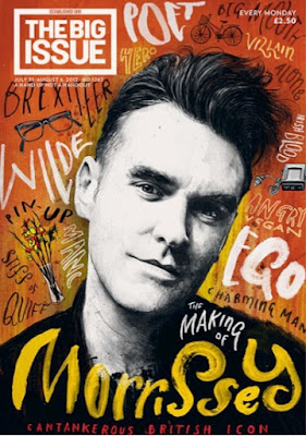
Compare and contrast of big issue covers

Image result for big issue front covers

For the big issue cover I have created, I have tried to emulate and match Big Issue’s style as much as possible. For example, I took reference of the Morrisey cover layout such as having a person as the focal image in the center of the page. Both people have eye contact with the audience in order to create direct engagement and therefore encourage readers to buy the issue. Despite this, I’ve edited my focal image unlike the other cover. I’ve also written in a bolder font so that it would be more likely to catch the readers eye. This is done so that the audience will be able to see what the issue will be about and whether or not they would be interested in it’s potential content. I’ve also tried to create a consistent theme in colour and style with the same styles font and black and white as the colour scheme in order to make it look more together.